 One of my favorite things to do is blog hop. I love to go from blog to blog to blog reading, and looking, and to be honest, analyzing what’s going right on the site, what could maybe be better, and what I just love so much I might steal for myself. 🙂
While this is all fun and good for me… it doesn’t really do the blog owner any good, me just sitting here in my lovely corner keeping it all to myself.
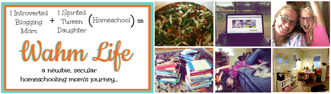
I thought it would be fun (and helpful) to bring a new feature to It’s a Wahm Life… one that lets me do the fun stuff I love to do, out loud, and helps out the members of my community!
***drum roll please***
Introducing Community Blog Review!
Twice a month, I plan to feature a blog from some brave soul in my community that has raised their hands and said “oh me me me me, pick me!” (or something equally enthusiastic). We’ll all take a look at the site and let the owner know our initial impression, what we think could be done differently, and the stuff we love so much we’d like to steal it for our own site!
Here’s the rules: (Hey, I’m Jackie Lee ~ I gotta lay down some rules!)
1. comment with kindness in your heart.
We’re all here to help one another grow ~ the best way I’ve found to do that is in a loving and caring manner. Even the parts we think might be done differently we can still approach those comments in a loving way.
Putting yourself, your blog, and your heart and soul out there for critique is some scary shit. So let’s play nice.
WOW ~ I must be getting better… I really only had one rule. 😀
So for our first Community Blog review I asked for volunteers in this week’s newsletter. (You are subscribed right? Good stuff comes in the newsletter!) I had a brave soul jump forward and I’m so thankful she did!
Her name is Rachel and her blog is called Teaching the Future. In her note to me she stated “It’s a blog for parents of LD kids with hands on learning games and parenting tips.” I’m already in love with the fact she has a wonderful and clear focus for the site… more of my thoughts later.
Please, jump in, and right down there (scroll past the contact form) in the comments section, let’s give her some feedback, and some appreciation for being so brave to get this party kicked off. I will definitely be back with some of my own thoughts, but I wanna see what you all think first! Click over to Teaching the Future, take a look around and come back and give Rachel some actionable feedback. 🙂
After you’re done giving Rachel some helpful thoughts… think about whether you might like to be featured in an upcoming Community Blog Review. If you do… please shoot me an email, let me know the name and url of your blog ~ and feel free mention anything you’d like us to specifically look at about your site. 🙂
YAY! Let’s get started!


I very much like the openness of the theme, right from the start. It’s very clear what you’re about, and what I should do.
The only thing I didn’t like was the pop-up in the middle of me reading something.. but I understand why its there.
You go Rachel for stepping up to the plate for the first community blog review!
Great addition Jackie – good stuff for sure.
1. I LOVE the fact that you have various ways and places for folks to download your Summer Workbook. Felt very natural and not intrusive.
2. I’m a Thesis theme fan – good choice on a premium theme.
3. In the sidebar – I would offer a suggestion to separate the “Read These…” and the Popular Posts widgets. Lots of text without giving the eye a rest.
4. Does your workbook have a e cover? Could you design one to display in the sidebar sign up form? People like the visual even though they understand that it is a digital download.
5. Some folks (like moi) hate RSS subscriptions. Can you offer an email subscription for us cantankerous types?
6. LOVE your design for the site. Clean, visually appealing.
Man… I knew I should have copied what I just posted above.
Rachel… I LOVE your site!
Clean and clear.
Love that you show link to your workbook on top AS WELL AS on the side.
Love your use of images.
and
Love your subject!!! (maybe that’s blinding me to flaws?!? LOL)
So delighted to have ‘found’ you… Thanks!
Thanks to everyone who has commented so far! I really appreciate it!
Here’s some of my thoughts… and they’re similar to the ones above.
Love:
The clean layout.
Sharp colors.
Plenty of white space.
Clear clear clear topic. I know right away if I’m a match or not for this site.
I love the strip at the top with a way to download the book. Very eye catching.
I like that you’re giving me an age range on the book, so I know if it’s going to work for me or not.
I personally love the title and tagline font. It makes the site approachable and friendly for me ~
The “read these” posts with them being full page posts the font seems a little small to me. I love that you’re making them “sneeze pages” and having plenty of content to send them to, but the link list is a bit hard to read ~ just because they seem so close together with the width of the page. The turbo charge your child’s learning skills one is better than the others ~ you didn’t use the bullet points for the links, so there’s some white space between them… makes it much easier to read.
I’d pull the “views” off your popular posts (I’m sure there’s a button you can tick somewhere), until you have a bunch of views, having that number there can actually work against you…
I agree with Frank that a visual ecover for your workbook would definitely add to the visual appeal and really draw my eye to that area.
I would add something that makes it easier to share your posts on facebook and twitter… when I find good stuff I really like to share it. I’m less likely to do it, if it’s hard for me to do. There’s plenty of plugins/options for sharing buttons. I see that you have it in sexy bookmarks… but something a little more obvious would be good as well… sexy bookmarks has a new version out that adds a fb share button below the pop up buttons ~ it also has a google+ option now.
well… that’s it for now… as I ponder on it I’m sure I’ll be back with more. 🙂
Rachel, what a great blog and kudos for submitting for review!
I agree with what has been said so far. I can definitely tell if your site applies to me instantly.
Couple of other ideas:
– I’m viewing your site in Chrome and am not seeing an ico file (the little logo in the tab).
– If you can, I’d make the top bar with the download a little bit larger, of course the picture like Frank mentioned would make it pop in the side bar
– I’m not a fan of pop out sign up forms either. Although, yours looks very nice. I did have to close it twice. I’m not sure why. There were two “x”s.
– I’m not sure why there are two rss feed links. One is teeny-tiny inline with the tabs and the other is large. I’d pick one.
– Feedback about RSS, I usually prefer for most sites I follow unless it is something I REALLY don’t want to miss, ike Jackie’s site ;-). So having both options for folks is good.
Again GREAT job. It looks very clean and I can tell you have put a lot of time into your site.
All the best.
Thanks everyone for the warm reviews! It’s a relatively new site (1 year) and I just switched Thesis a week or so ago (after a few weeks of really hard work-I know nothing about theme design), so there are still a few kinks.
@Kelly- Glad for the compliments! Sorry about the pop-up. I’ve been unsure about that but I think I’ll get rid of it. There are plenty of other ways for people to sign up.
@Frank- thanks for your suggestions. I’ve actually been wanting to put a picture there. It’s aWeber and I haven’t yet figured out how to do it. Also you’re right about the Read These and Popular Posts, I’ll think of something.
Those are text widgets, so it might be a bit tricky (more programming, I guess 🙁 ) I’ll try and take care of the e-mail subscription over the next few days-that was something I hadn’t thought of.
@Mary K.-Thanks for the compliments! The link on top to download the e-book is from http://hellobar.com. They have a free version and a paid version, and you get a 7 day trial of the paid version when you sign up for the free one.
@Elian. Appreciate you stopping by! I’m not sure what an ico file is. Is it the little globe next to the address in the navigation bar? And you’re right about that teeny RSS pix; it comes with Thesis and I don’t know how to get rid of it. It’s obviously too tiny to be of any use.
The bar on top, which is the Hello bar, can’t be customized any further. You can only change background color, text color, and link color. I’m not complaining though- it’s free.
@Jackie ( I saved the best for last) Thanks again for giving me the opportunity to do this! I’m lovin’ it! Didn’t realize about the link list, but it’s fixed now. Re: popular posts, I had hundreds of views for each post…until I changed my theme. Apparently once you deactivate it ( I had to deactivate to update to a newer version of WP and change my theme) you lose all previous info.
I don’t know if I can take it off and still have it collect info. Also, if you notice, I don’t have any category lists up. I do that purposely, because I want to provide a clear pathway for people to find help for their specific problem. I don’t want them to get lost in my individual pages.
I think that by seeing relevant articles packaged together, parents hopefully see that I can offer them a cohesive solution to the specific problems they have- building more trust in the downloadable workshops I plan to offer. So if I take pop posts away, readers will have no real way of searching my content unless they go to archives.
Re: sharing buttons-could you be more specific about what makes it easy for you to share? Is it where the buttons are placed? Or do you mean the size or the type of button?
Wow! That is a beautiful theme. Clear and easy on the eyes!
I am older than most of you (grandma here) and I had trouble with that light orange. Wish it were a bit darker. but that may be my aging eyes.
(to tell the truth, I am reading this pink with some difficulty, so it’s probably me!)
I kept looking for what you were selling. then I saw the strip across the top. so you definitely need a book cover.
and yes, I like to follow blogs in my email too. I RSS some, but my favorite ones are in my email.
Your blog is lovely, and will be helpful to so many. Thank you for allowing us all to have our say.
i love how you place everything in order. You’re skilled with this. Keep doing what you’re doing and keep inspiring others! 🙂
@Joan- I really love what I do, so I’m happy you found my blog helpful. And of COURSE grandma’s are especially welcome :). By the way, the e-book is free- I have a product but it’s not up yet, as I’m still preparing material for the launch.
@Daniel- Thanks for the support! I started blogging because I felt I had so much experience to give to others, and not enough time to do it in. So it’s great to hear that others are inspired by what they learn on my blog, because that’s my real goal.
@Jackie- you were right, it was possible to fix the popular posts. There’s an option that lets you select whether or not you want to show the most popular posts of the day, or all time.
Sometimes I miss the most obvious things :).
WOW Great clean look. Only thing I would suggest (maybe as an older reader) would be to increase your font size. I find myself squinting a little…not good. So many of your ideas bring back great childhood memories. Thanks!
@Jennifer-Great to hear from you! Thanks for the suggestion – I’m really awful about wearing my glasses so I never know if it’s just me that can’t see :).
I’ll try increasing the font size on future posts.
I’d always error on the side of larger font… font looks so different depending on a person’s monitor. I think it’s always better to be able to see the words easily. 🙂
Rachel,
This was my first time on your blog and I’m actually glad I found you…I have a niece with Downs Syndrome and I think this will be very helpful for our family.
I think you have a wonderful mission with your blog and a very clear concept…I can’t wait to dig deeper into it to find more helpful information for our family!
I hate critiquing other bloggers because I am one too…and well, nobody likes criticism…so I hope I can come across in a kind helpful way.
That being said, my first impression of your blog was “Wow. There’s a lot of content here.” I felt a little overwhelmed with the amount to read, albeit very good content and ideas.
I am a picture person, so I tend to skim through blogs sometimes letting the pictures grab me and take me into the content.
Overall, I think it’s really good, my critiques really only have to do with aesthetics.
Great blog. Thanks for being brave!
@Jennifer-Thanks for stopping by! Thanks for your comment; I’m so not a picture person, so its good to hear your suggestion.
I assume you meant more pix for the hands on learning games? I agree that they need the pictures; it would give the games a lot more value and make them easier to use.
Hopefully I’ll find the time to make all the pix that go with them…:)